Vacation Rental Website – How to Go Mobile
Riding on the underground, waiting at the airport, sitting in the park, or even when you are admiring a tourist attraction abroad, you will notice the majority of the people around you glued to their smartphones or tablets.
Multi-tasking has become essential in order to exist in our technology-hungry world: Why wouldn’t you book your next holiday tickets when you are still on holiday?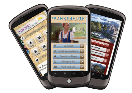
It is coming close to impossible to ignore the large number of mobile and tablet users when marketing your vacation rental property. Need convincing? Over the past year tablet ownership rose by 177% and 25% of users use smartphones, not computers, for majority of web surfing.
If you have an image heavy website that runs fancy flash plugins, the user experience when viewing your website from a mobile device will not be too pleasant. Optimizing your website for mobile usage does not have to be time consuming and expensive. The general guideline is to keep your mobile website a simple version of your desktop website.
Vacation rental website management platforms, such as Kigo’s website solutions, are able to create mobile optimized versions of your website in no time inexpensively. Below we have highlighted the key factors to include when you are creating a mobile optimized website:
Utilize Past Data:
Your desktop website statistics from Google Analytics can provide you with very valuable data when it comes to what you should include in your mobile website.
Check which pages your past customers have visited the most, and make sure they are easily accessible when a user visits your mobile website’s homepage. Low traffic webpages can still be featured but not as prominently.
Ensure your users are able to book properties with as little hassle as possible. Be sure to include calendar and booking reservation tools, as well as key contact information that will allow users to book a property on the go.
Optimize for Different Devices:
Your mobile website should provide the same user experience for those who access it from a tablet and for those who access it from a smartphone. Ensure that your images, buttons and text are adjustable based on the device the user is using.
Simple Layout:
The most important factor when designing a mobile website is to keep it simple. The user has limited space on their device, and should not have to zoom in or out when browsing your website. The current benchmark mobile website layout is a single column, where the user can scroll vertically but not horizontally.
A/B Testing:
Utilizing successful tried-and-tested mobile marketing strategies are a great starting point, however you should be testing your mobile website to ensure it receives the highest conversion possible. A/B testing (offered for free by Google or as paid service by other providers) allow you to split your website traffic into two and shows different versions to different users. You will then be able to see which design, wording, and call to action buttons are the most effective for conversion.
Is your website mobile optimized? Do you see a rise in bookings from your mobile website? We would love to hear your thoughts and experiences. If you have any comments or questions, feel free to write to us in the comment section below.

If you are in the market for a new vacation rental website that is mobile optimized to manage your inquiries, bookings and marketing, consider using Kigo. You can reach us at [email protected] or on the phone (Spain) +34 512 702 105 ‧ (France) +33 1 84 17 04 18 ‧ (USA) +1 (786) 292-0030
Related Articles

Beauty and Brains: Why Your Vacation Rental Website Needs Both
In the vacation rental business, websites play an outsize role. Consider read more

Top Seven Features of Vacation Rental Websites
Beyond your rental properties themselves, there is nothing more important for read more

Six Vacation Rental Website Requirements
If feels unsafe. It takes too long. It’s frustrating. An outdated read more

4 Vacation Rental Website Mistakes to Avoid
Avoid These 4 Vacation Rental Website Mistakes Positive images like smiling people read more

Vacation Rental Listing Sites Back Up after Hacking
Friday, October 21, was not the best day ever for internet read more

How to Make Your Vacation Rental Website a Lead Magnet
What tool do you have at your disposal that will generate read more